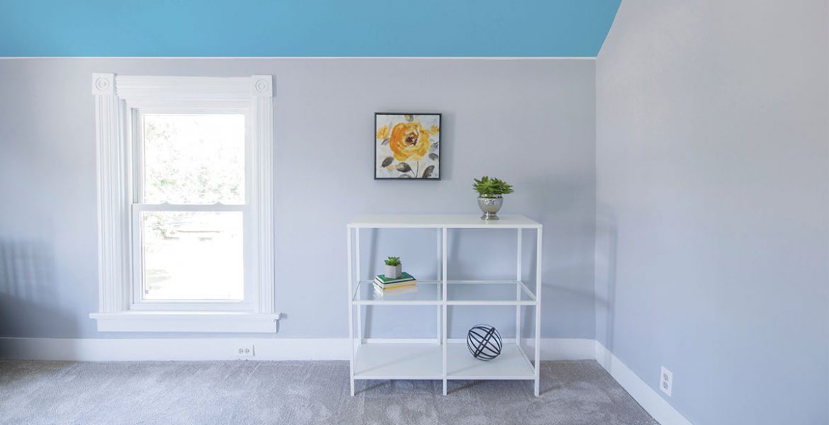
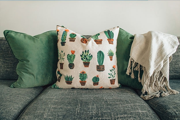
Any decorating rule is breakable as long as you are achieving balance in your design and the space is pleasing to your eyes. Yes, YOUR eyes. It’s your home, so it’s you who should be feeling comfortable around it. Rules exist for a reason, but let’s face it, some deserve to be broken. Here are a few:
RULE 1: Start with a neutral base – keep your sofa in a neutral color
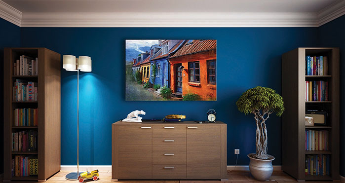
If you’re someone who likes to change things around a lot and easily get bored, you probably want to stick with a neutral sofa. But if you’re someone that has a favorite color and want to always see it around, a colorful sofa can be a perfect investment that you will not regret.
As much as it sounds safe and timeless to stay in the neutral side, going colorful with your sofa is such a statement. Having a statement sofa in your house does not necessarily mean that it should red or blue. It can come in a saturated color and give a room the pop that it needs and can be toned down with simple throws and muted colors.
RULE 2: Always paint your ceiling white
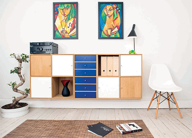
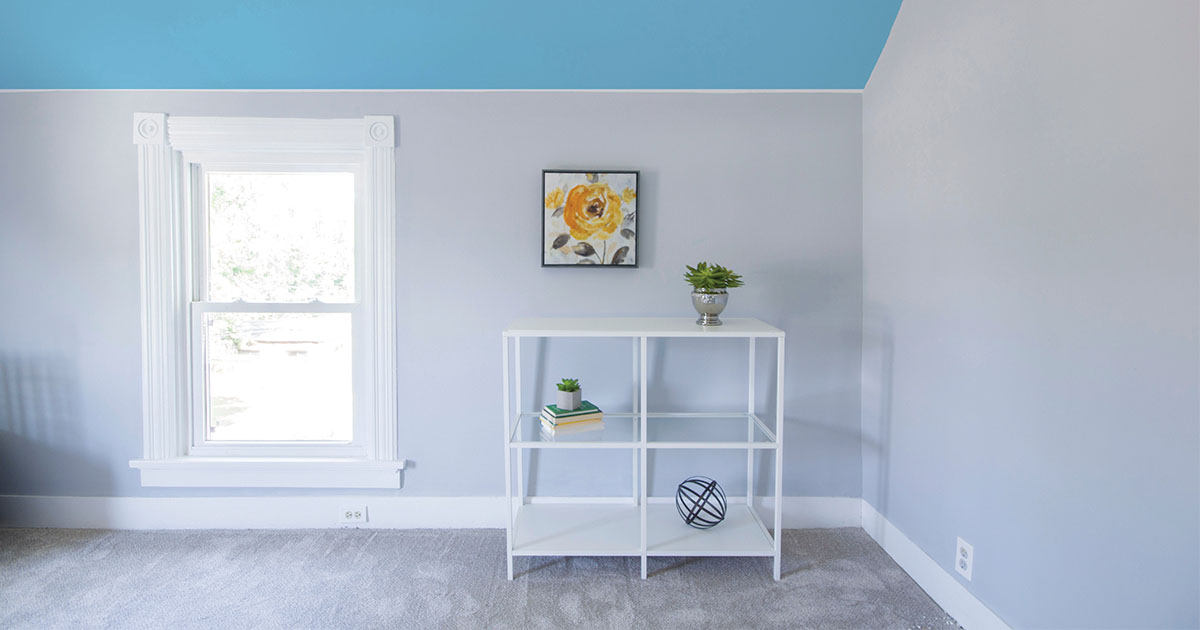
The ceiling represents one-sixth of the space in a room, but too often it gets nothing more than a coat of white paint. Sometimes it is the perfect solution, but if you never consider anything beyond ordinary white, you may be missing an opportunity to add excitement and drama to a room. Painting the ceiling is coming into style especially if you are lucky enough to have high walls.
Painting your ceiling in a different color than white can really make a statement and give your space a rich atmosphere.
RULE 3: Art should not be too big
When picking art for any room BIGGER IS BETTER! There are rules that give you space to play around size choice but these rules can be broken as long as you create the look you want.
Take into account the amount of furniture that you have in a room, if not too much, then a large piece of artwork will fill up the space as much as furniture. Meanwhile, if your ceiling is high then feel safe to go for an over-sized painting, if not then go for a shorter canvas height with landscape orientation.
RULE 4: Don’t mix different patterns and textures
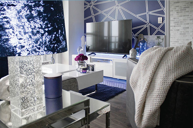
Imagine walking into a room where all you can see has the exact same shade of color and texture. You will definitely find this room extremely boring. Mixing different colors, patterns and textures in a balanced way plays a prominent role in your space and creates harmony.
When it comes to mixing and matching, patterns are often the first things that come to mind. After all, you can use them to infuse both color and visual interest into the space for a minor cost when compared to similar items in neutral tones. Plus, you can apply them anywhere in the room from wall coverings, to accent furniture pieces, and accessories like throw pillows. The key to do this successfully is combining different prints that still have a few common threads to tie them together and try to keep them within the same color palette.
RULE 5: A room should have ONLY one style
People are always hesitant to mix and match furniture styles especially when they don’t really have the know-how of decorating. They worry that doing so will take their meticulously planned space from a pulled together room to a sloppy mess. This is actually not true. Nowadays, we hear the word ‘eclectic’ everywhere. Having a bit of different styles in a balanced way will make your space more interesting and gives more space for you to keep your home look more personal.
Even though decorating rules can be very helpful, there are often reasons to break them. As with anything in design, it’s important to always trust your instincts, trust your eye, and always decorate with things you love.

